It’s now been over a decade since the great tech bubble burst in the year 2000, but even today technology stocks are still popular among most investors and the financial media. There are good reasons for the continued popularity of technology stocks. Not only do tech companies deliver us cool new products each year, but many tech companies have delivered great stock returns as well. This creates an opportunity for investors to follow one of Peter Lynch’s famous principals, which is “invest in what you know”. Most investors have used one or more of the products these companies produce, and naturally they want to invest in the growth of the technology products that they enjoy.
When gold and silver moved from a bear market into a bull market way back in 2001, they started competing for the attention of investors. And as the gold and silver bull markets have progressed over the last ten years, they have steadily gained more attention from the media and from investors. New products like exchange traded funds have even been created to allow investors more access to precious metals investments. Even with the increased exposure precious metals have gotten though, they are always going to be competing with other asset classes for investors’ capital, which includes tech stocks.
Since the 2009 stock market bottom the overall market has rebounded strongly and some favorites in the tech space have provided exceptional returns. The table below shows the returns of some of these stocks from March 9th, 2009 to March 11th, 2011. Included in the list are Priceline.com (PCLN), SanDisk (SNDK), Netflix (NFLX), Apple (AAPL), Salesforce.com (CRM), Juniper (JNPR), and Amazon.com (AMZN). Also included in the table is SLV, the most popular silver ETF. Notice how these seven tech stocks have outperformed SLV since the stock market bottom in 2009. Three of the stocks have more than doubled the performance of silver.
| Stock | March 9 2009 | March 11 2011 | % gain |
| PCLN | 78.36 | 463.19 | 491% |
| SNDK | 7.65 | 45.07 | 489% |
| NFLX | 38.5 | 204.54 | 431% |
| AAPL | 83.11 | 351.99 | 324% |
| CRM | 30.89 | 127.87 | 314% |
| JNPR | 12.68 | 42.89 | 238% |
| AMZN | 60.49 | 168.07 | 178% |
| SLV | 12.77 | 35.03 | 174% |
In order for silver to take investors’ attention away from popular investments like tech stocks and into silver, silver is going to need to do one or both of the following things going forward:
1. Outperform other popular investments like tech stocks
2. Trend higher while other asset classes are going lower
A recent example of the second item above occurred when oil continued higher in 2008 while most other asset classes had already started trending lower. The advance in oil ended up accelerating before it topped because it attracted capital away from asset classes that were not only underperforming oil but also were trending lower.
When SLV broke out of a multi-year consolidation in August 2010 into a strong advance it also started outperforming other asset classes, including many of the tech stocks mentioned above. The next table shows that since August 1st, 2010 only PCLN has outperformed SLV.
| Stock | August 1 2010 | March 11 2011 | % gain |
| PCLN | 224.4 | 463.19 | 106% |
| NFLX | 102.55 | 204.54 | 99% |
| SLV | 17.58 | 35.03 | 99% |
| JNPR | 27.78 | 42.89 | 54% |
| AMZN | 117.89 | 168.07 | 43% |
| AAPL | 257.25 | 351.99 | 37% |
| CRM | 98.95 | 127.87 | 29% |
| SNDK | 43.07 | 45.07 | 5% |
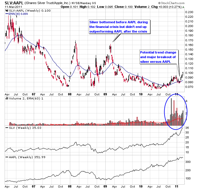
The chart below shows the ratio of SLV to AAPL, which graphically presents a performance comparison between the two. Notice that since the March 2009 bottom the ratio of silver to Apple has trended lower, meaning that silver has underperformed Apple during that time period. Since the fall 2010 breakout in silver though the trend has started to reverse back to the upside as shown on the chart. Note the big increase in volume on the chart as well. On a ratio chart the volume of SLV is divided by the volume of AAPL, so seeing a big increase in volume on this chart means more volume was coming into SLV than AAPL. This is the biggest increase in volume into SLV compared to AAPL since the SLV ETF has been in existence. Often a big increase in volume helps confirm a change in trend since a considerable amount of buying or selling pressure is required to create trend reversals.
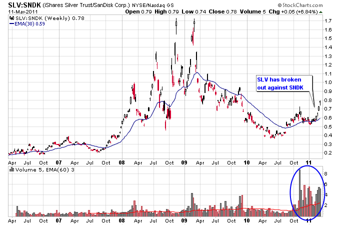
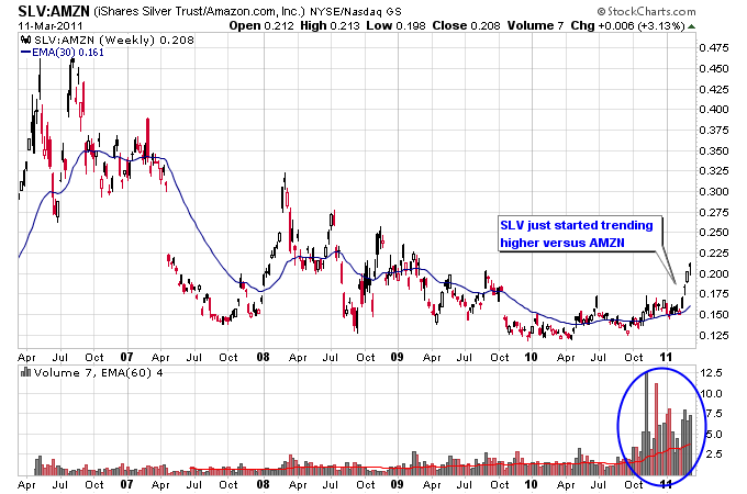
The next two charts show the ratio of SLV to AMZN and SNDK. The same thing has occurred on these two charts where the trend in silver versus Amazon.com and Sandisk has reversed to the upside on a big increase in volume.

The outperformance of SLV compared to the popular tech stocks above over the last 6 months could lead to SLV landing on more investors’ radar, especially if SLV continues to outperform going forward.

