The market continues to be under pressure with lingering uncertainty over the status of the nuclear problems in Japan. The market hasn’t corrected this badly since November 2010 where it went down 4.4%. The table below shows the major corrections since the start of 2010 and at 7.1% the magnitude of the current correction is now approaching the August 2010 pullback:
| S&P 500 Corrections 2010-2011 | |||
| Month | High | Low | Diff |
| Current | 1344.07 | 1249.05 | -7.1% |
| November 2010 | 1227.08 | 1173 | -4.4% |
| August 2010 | 1129.24 | 1039.7 | -7.9% |
| June 2010 | 1131.23 | 1010.91 | -10.6% |
| April-May 2010 | 1219.8 | 1040.78 | -14.7% |
| January-February 2010 | 1150.45 | 1044.5 | -9.2% |
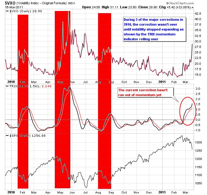
One indicator that is used to measure the intensity of stock market corrections is the Volatility Index, which is often called the “fear gauge”. The Volatility Index usually moves opposite to the stock market, and tends to spike higher during major market corrections. The next chart shows the $VXO Volatility Index with the TRIX indicator underneath it. The TRIX is a momentum indicator that filters out some of the noise typically found on the MACD indicator. Notice on the chart how during three of the major corrections of 2010 they continued along until momentum to the upside in the Volatility Index stopped increasing, which is indicated by a rollover in the TRIX. The shaded red areas show where volatility was increasing until it rolled over. In the case of the June correction which followed the April-May correction, volatility was still high enough at that point even though the momentum had rolled over to cause another 10% pullback.
The current correction still hasn’t run out of momentum to the upside on the Volatility Index, which means we could have room further to fall before downside momentum in the market is extinguished.
