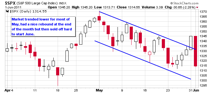
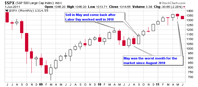
May was the worst month for the S&P 500 since August 2010, but the percentage loss for the month only ended up being about 1.5%. The four day rally at the end of May, including the big up day on Tuesday, served to soften some of the damage done in May. But the market reversed all of that bounce in one day to start June with a massive selloff.
Poor economic statistics was one of the main reasons for the selloff on Wednesday. The ADP Employment Report and the ISM Index both came in below expectations. This was on the back of a poor Chicago PMI and Consumer Confidence numbers, and confirmation from the Case-Shiller Index that housing has officially reached double-dip status.
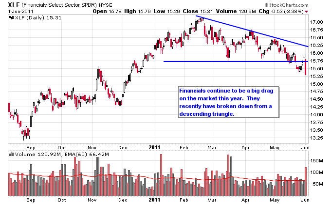
I noted in a previous article that the financial sector was extremely weak so far this year, and it has been a drag on the market as a whole. The performance graph below shows that the financial sector is the only sector that is down so far this year. The rotation into defensive sectors is also clear on this graph with Healthcare and Utilities leading the market.
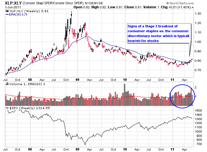
Another potentially negative signal for the market is the Stage 2 breakout that is starting to form in the Consumer Staples sector vs. the Consumer Discretionary sector. This ratio chart trended higher during the 2008-2009 bear market and when that concluded it began a long trend lower. Over the past few weeks this ratio has broken back above the 30-week moving average on strong relative volume flowing into the Consumer Staples sector.
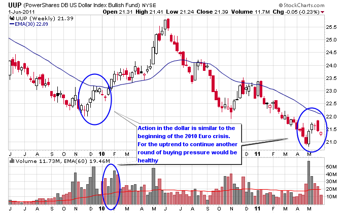
Not only are deteriorating economic indicators making news but the Euro crisis continues to rear its ugly head. The European Union is attempting another bailout package for Greece but the market so far isn’t putting a lot of faith in it. The Greek stock market is falling and credit default swap prices are surging. The dollar is exhibiting a similar technical pattern to the start of the previous European debt crisis.
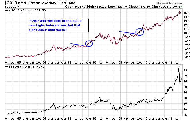
Gold has held up fairly well in recent weeks and is threatening to make a higher high. This is in contrast to silver which is still stuck deeper in its trading range. Gold actually broke out to new highs before silver in 2007 and 2009, but that didn’t occur until the fall of both years, and after gold attempted and failed to make a new high in the summer. It should be interesting to see whether gold repeats that same pattern this year.
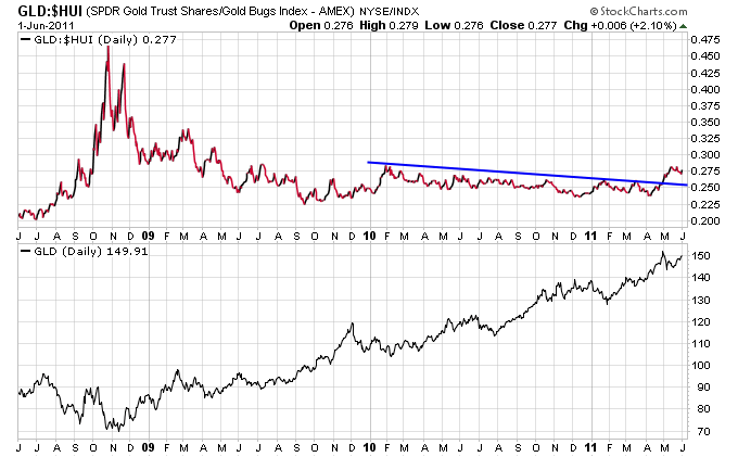
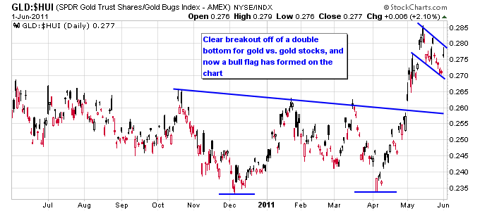
One factor working against gold is its relative outperformance against gold stocks, which is typically a negative sign. The next two charts show that gold has broken out against gold stocks on a relative basis. The ratio has also produced a bull flag recently which isn’t a good sign for the gold sector.
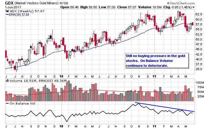
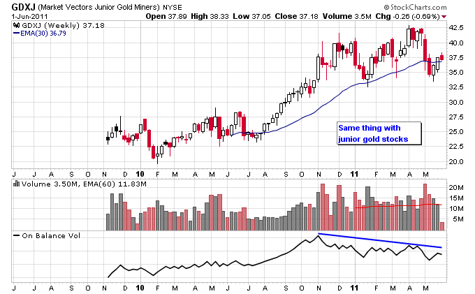
There also has been a lack of buying pressure in gold stocks since last fall, which has contributed to the unwillingness of gold stocks to outperform gold over the last few months. A pickup in volume will probably be needed to break gold stocks out of this trading range. Until then they could be vulnerable to further selling in the general stock market.
