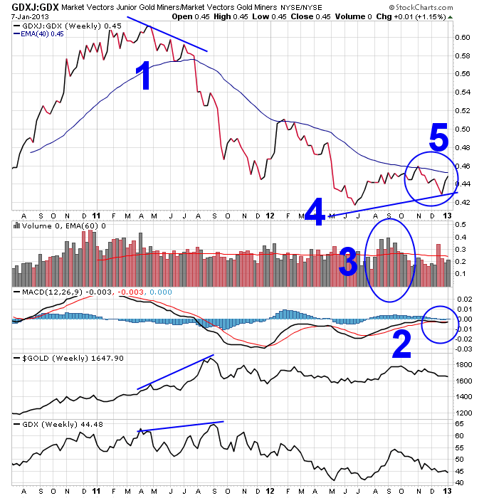
1. If you paid attention to the GDXJ to GDX ratio back in 2011, it gave you a 4-month heads up that something wasn’t right in the gold sector. The ratio made a series of lower lows while major gold stocks continued higher, and the price of gold surged higher into a parabolic top. This divergence forecasted the bear market in gold and gold stocks that has followed to this day.
2. But now to the good stuff, first the MACD ratio here is actually trying to hold up and not roll over. It is also challenging the all important zero level, which tends to separate uptrends from downtrends.
3. This is the kind of volume increase you want to see coming off of a bottom. And the pullback since October has been on mostly lower volume.
4. Maybe the most important thing on this chart, this price divergence could be forecasting a new upleg in the gold sector if it holds up, just like the last major divergence forecasted a new major downleg in 2011.
5. I’d like to see this ratio break above the 30-week moving average and see another increase in volume to confirm a real breakout higher.
This is definitely a chart to keep an eye on if you’re following the gold sector.
Connect with me on Twitter: @nextbigtrade
The original article and much more can be found at: https://www.nextbigtrade.com
The views and opinions expressed are for informational purposes only, and should not be considered as investment advice. Please see the disclaimer.
